Shredders

Shredders is a next-gen snowboarding game, currently being developed by Belgian based game studio Foampunch. Their credo, “By riders, for riders”, aims to make the game feel most natural to mountain dwellers across the world. Physics, virtual parks and slopes, not a detail goes unnoticed.
Services include: brand analysis — brand identity — brand strategy — design — art direction — tone of voice — copywriting — content strategy — communication — technology — ux/ui

We were asked to create a visual identity that matched the energy and attitude of the game. This resulted in an exciting process where we combined the snowboard lifestyle aesthetic with a dirty, punkish yet fun approach. Screenplay treatments, in-game elements and first game interface designs were cooked up and eaten with mucho gusto.
The overall identity is a mix-and-match of typographic styles, hand-drawn letters, pixel cut-out shapes, bright colours and a pinch of humour. This also resulted in a blend of logos that can be applied both digitally and physically. Think bandana’s, stickers, posters, emergency blankets but also social sticker-packs, pro rider announcements and animations.
Let’s shred!


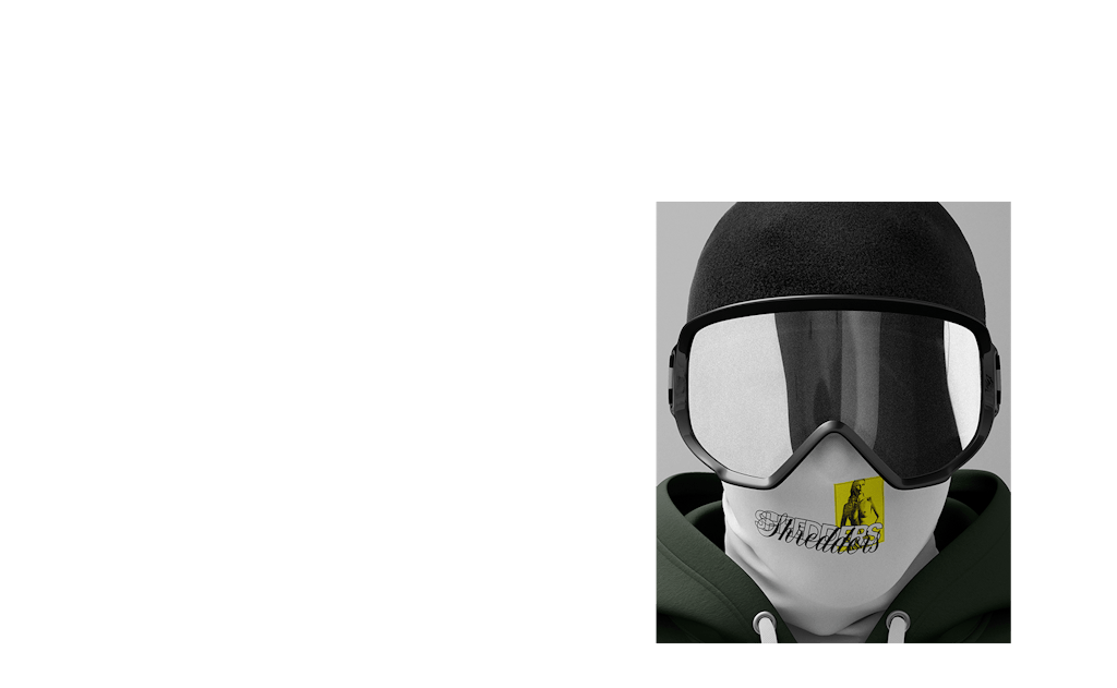
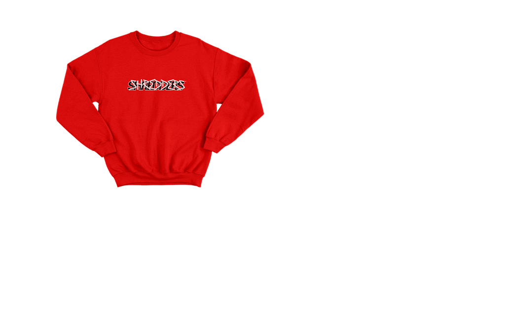
Communication wise we helped establish a content plan, timeline and pinpointed major related events. From last-minute Twitch events to the pro-rider announcements: templates were made, copy was written and funny content was posted.


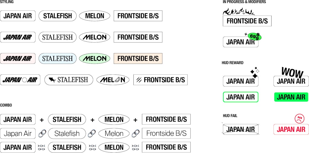
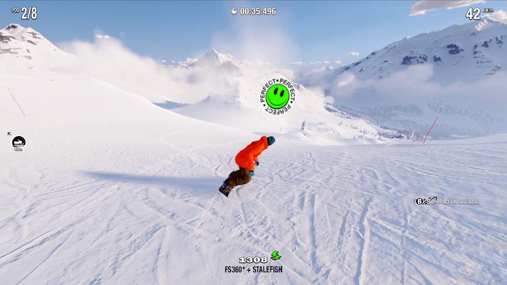
We also researched preliminary in-game design and proposed sketches on possible interfaces, HUD, trick language and more. The final design was done by Foampunch in-house.


Continuing on our previous visual concepts, we designed and built a digital system that’s also a perfect reflection of Shredder’s identity; by using bright colours, full-screen video and lots of visual noise.





Big shout out to our friend Daniel Goyvaerts for his help with the interface design research and bringing the brand to life with amazing animations. Game dev & in-game design by Foampunch. Some behind-the-scenes. Buy Shredders on XBOX.COM.