Kunstenpunt
Dedicated to the permanent development and renewal of the Flemish arts field
Since the start of our digital collaboration in 2016, our contributions and engagement with Kunstenpunt have steadily expanded. Thanks to the growing confidence in our expertise in both online and offline executions, 2023 presented us with the opportunity to actively foster the growth of Kunstenpunt as a brand.
Rather than stripping the brand of everything that made them previously recognisable, we opted for continuity, maintaining the accessible and neutral personality they already have. Apart from working with their existing online typography and colours, we implemented new logos and a clear framework, creating a unified visual approach across all channels.
Services include: brand analysis — brand identity — brand strategy — brand deployment — design – technology – wireframing – digital design – ui/ux

Expertise centre for visual arts, performance arts & classical music
Before 2023, the organization was divided into two entities, each with its logo: “Kunstenpunt” was responsible for the Flemish art community, and “Flanders Arts Institute” promoted these artists abroad. Since the rebranding, this duality has been eliminated, and the logos now serve as a language switch between each other.
Given the growing internationalization of the arts field, providing all information in two languages helps to reduce barriers and allows them to reach a larger audience; enhancing engagement, efficiency, and effectiveness.
To implement this language switch, we created seamless online animations and multiple templates that work for both logo sizes.
Empowering knowledge
through a strong framework
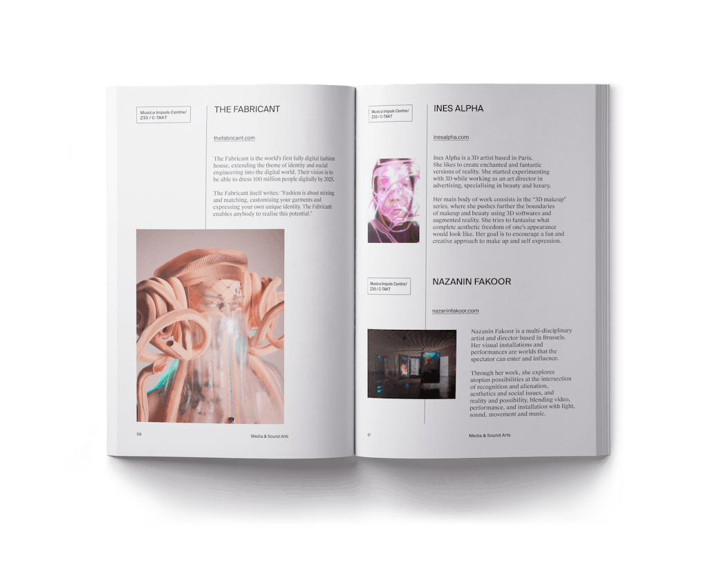
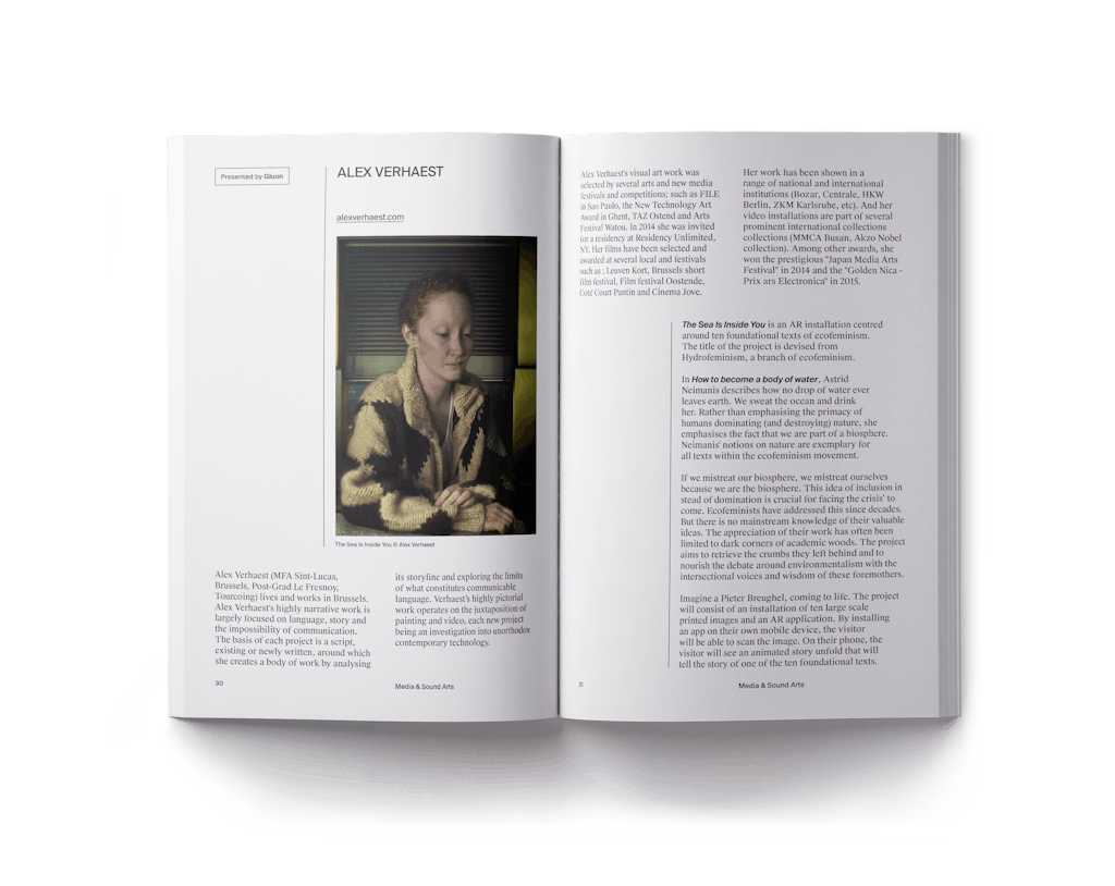
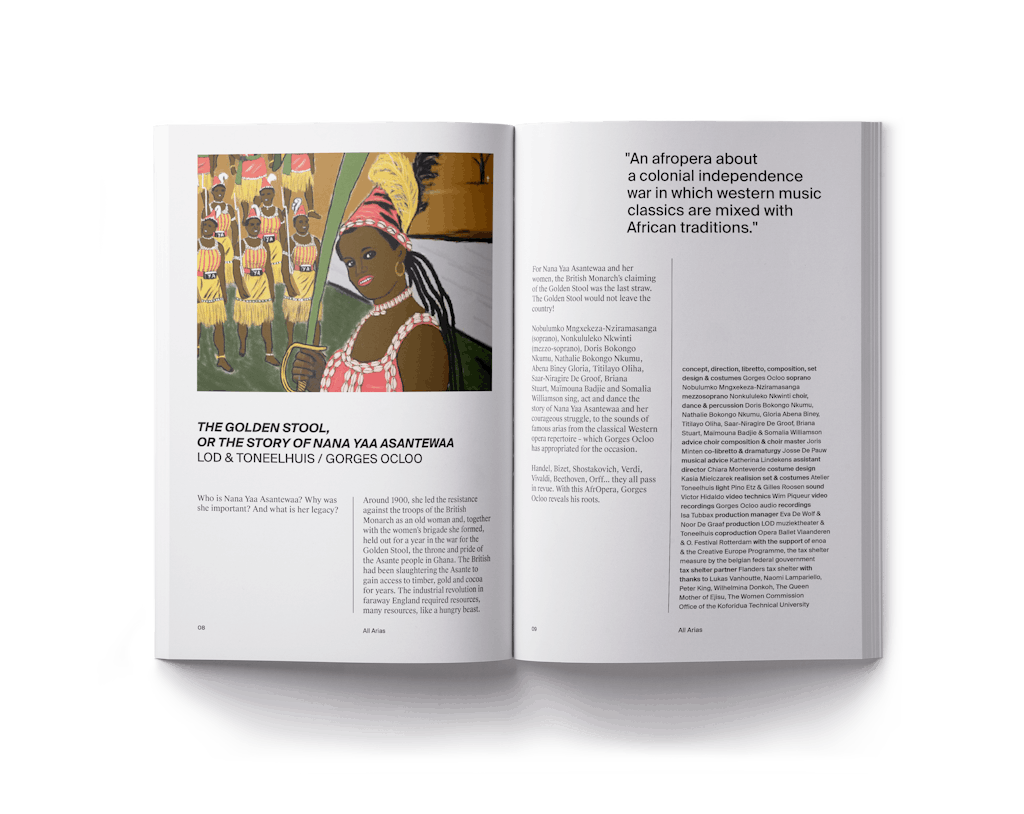
Kunstenpunt acting as an expertise centre for the arts, provides valuable support to the Flemish arts community. This framework is visually translated as a consistent thread running throughout diverse implementations, becoming a dynamic element with a practical purpose.
The newly implemented grids and structures create clarity, provide guidance, connect, and serve as a visual reference point, much like Kunstenpunt does itself. The flexible system creates clear spaces in which messages, text and images can be merged in various communicative scenarios.

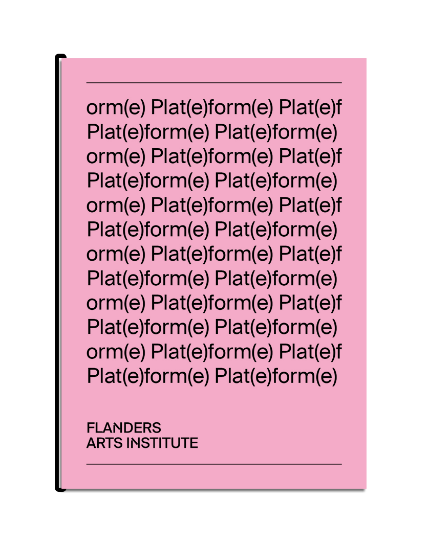
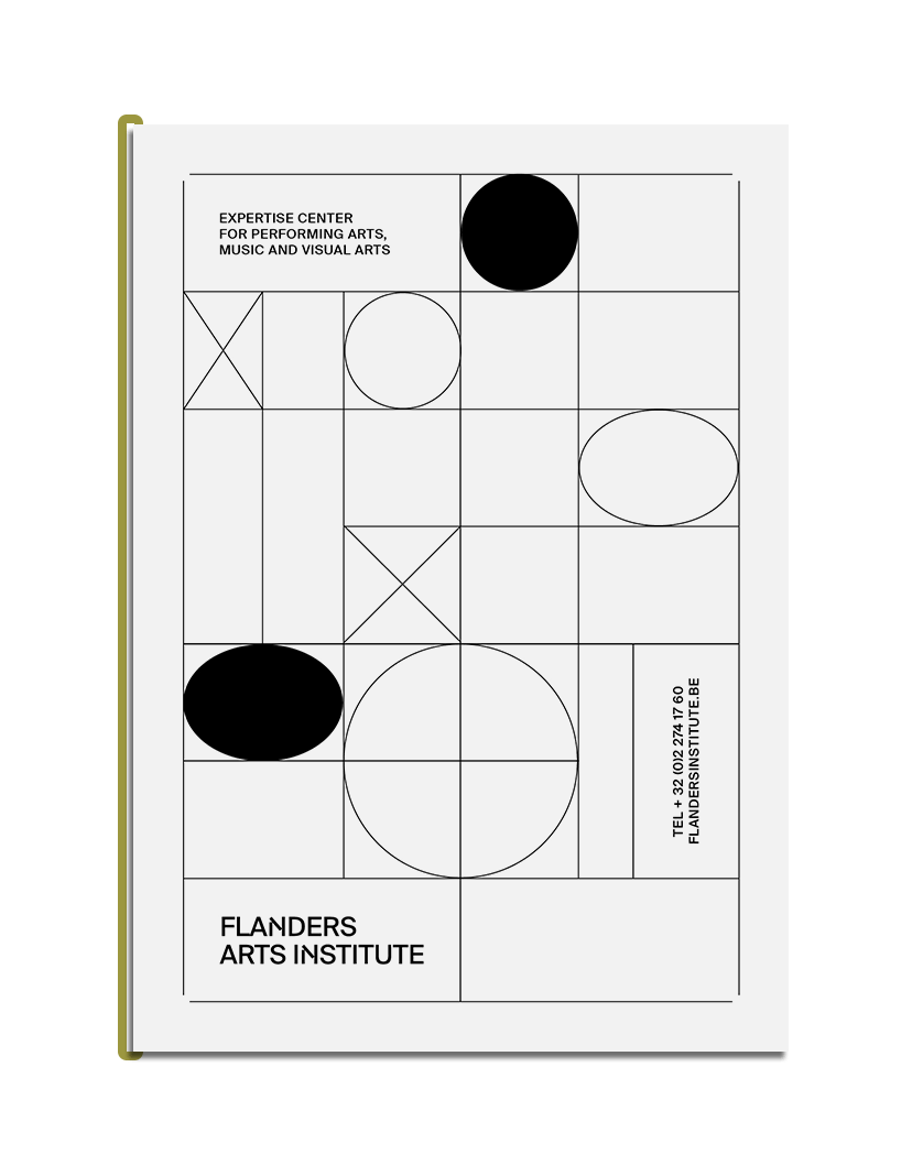
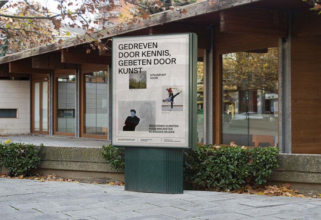
The grid system in use
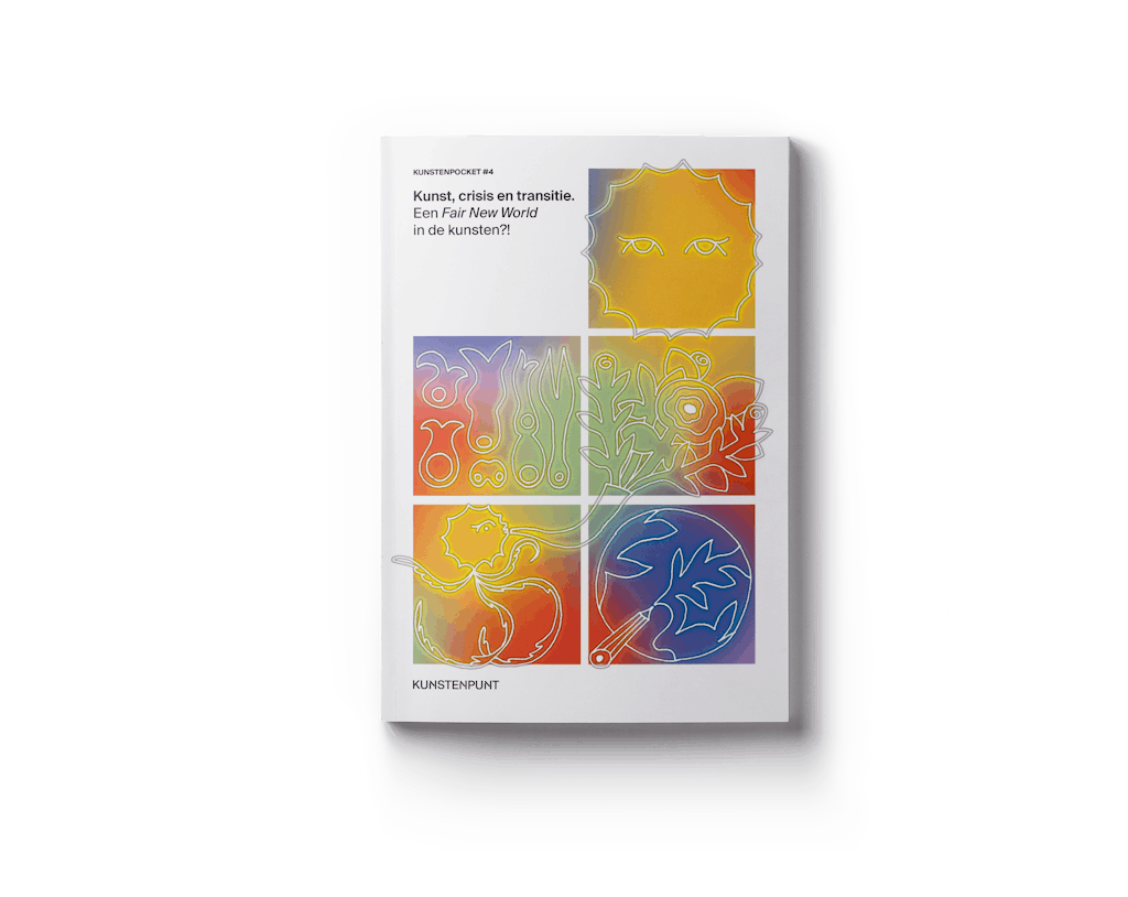


An unwavering continuity
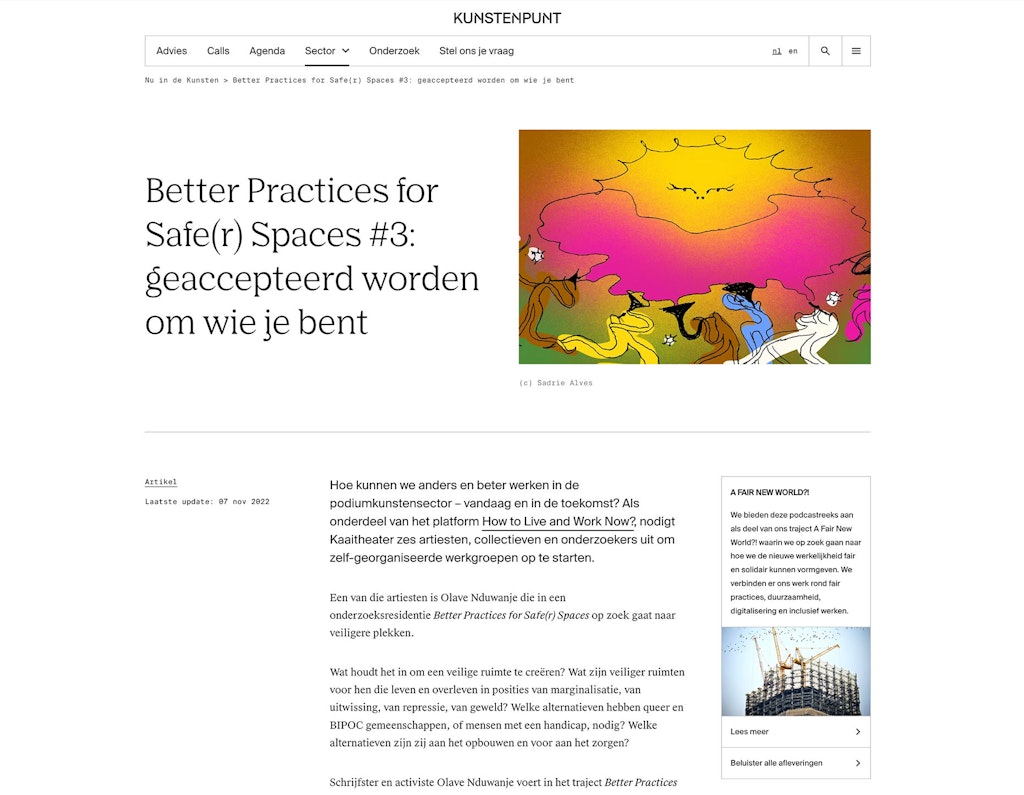
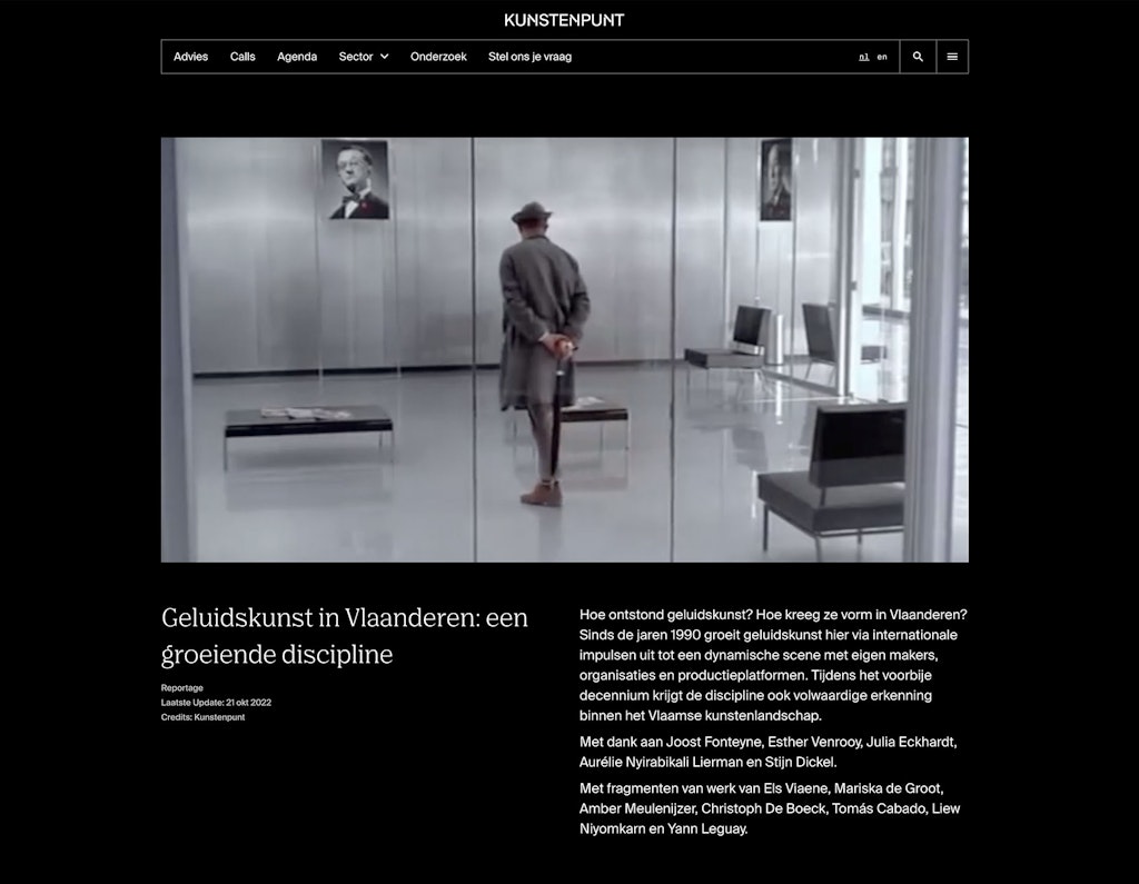
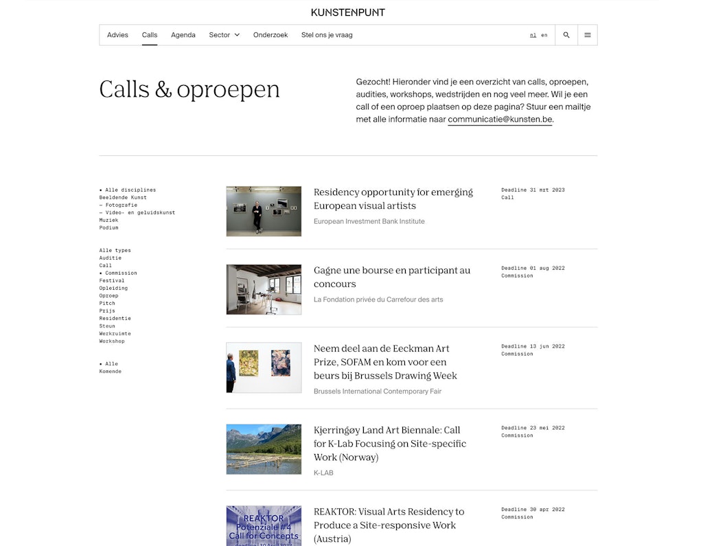
Because the current website was partly our visual starting point, a complete overhaul was not necessary. The flexible system within the site, in which elements can easily be combined to build pages and connections between all levels of information, still enables users to navigate seamlessly through a dynamic web of knowledge.
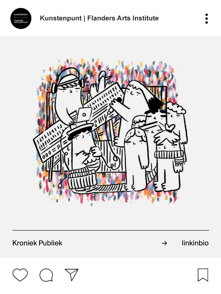
Making full use of the sophisticated colour palette and modern, well-considered typography, the newly implemented brand elements create a cohesive continuity between social channels, the website and the Arts database, another closely linked collab project with Kunstenpunt.






Belgian photobooks 2022 © Anne van der Pot