De Warande

Much more than just a stage
On October 28, 1972, de Warande opened its doors as one of the first cultural centres in de Kempen, Flanders. Fifty years, 20.000 performances, 2.000 exhibitions and countless events later, de Warande has become an integral part of Belgium’s cultural landscape. This half-century birthday called for a celebration and a renewed look at the branding.
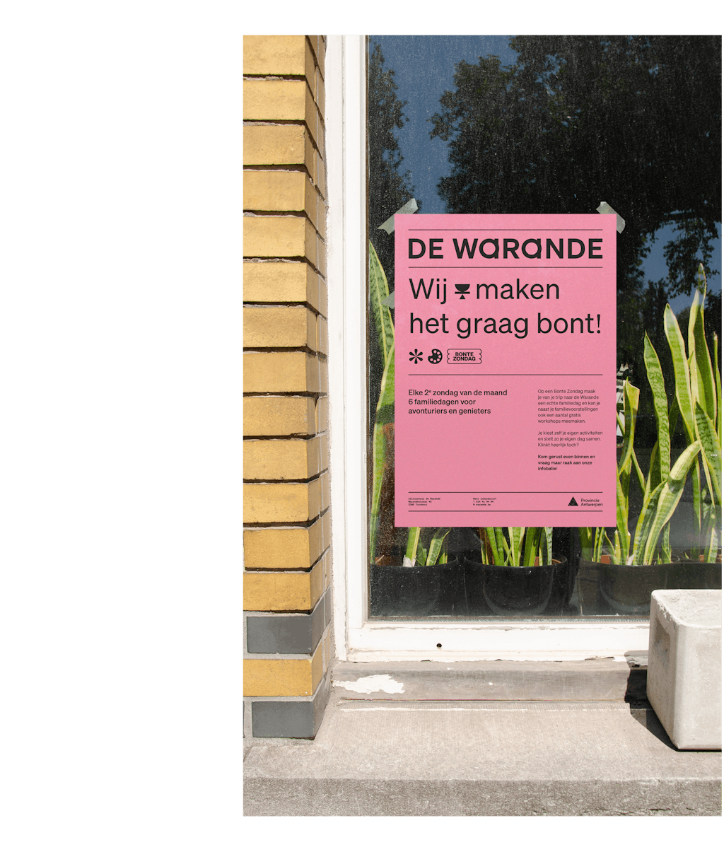
We, therefore, created a dynamic identity with broadly strategic and communicative capabilities, something lacking in the past. The branding became an intriguing juxtaposition of past and present. It enhances de Warande’s rich history but is at the same time able to evolve into the future while underlining the unique character of this vibrant and inviting place.
Services include: brand analysis — brand identity — brand strategy — brand deployment — design — art direction — tone of voice — copywriting — content strategy — communication — technology — campaign deploys
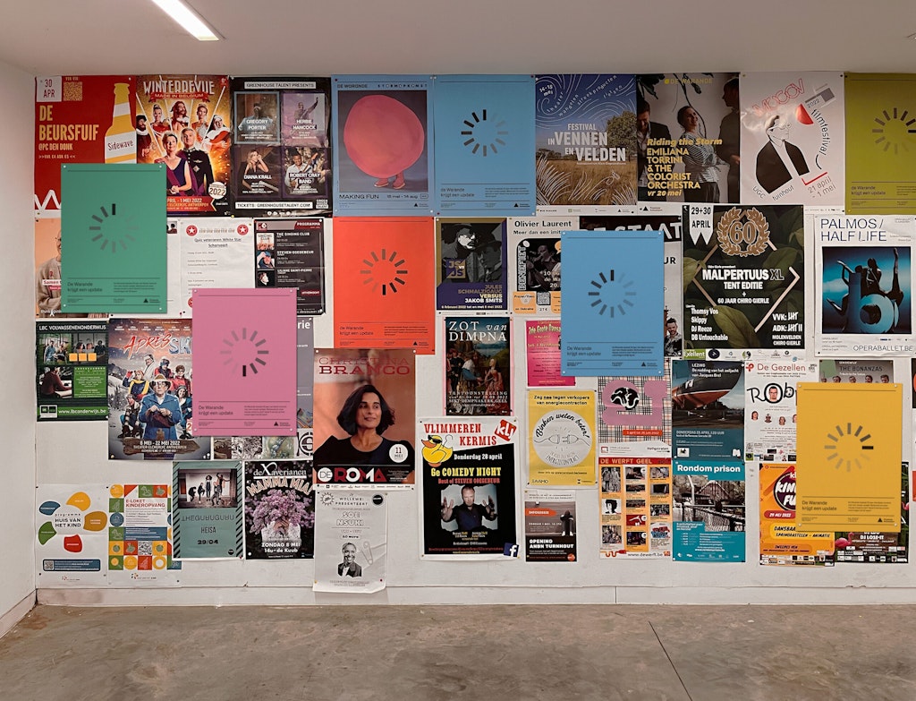
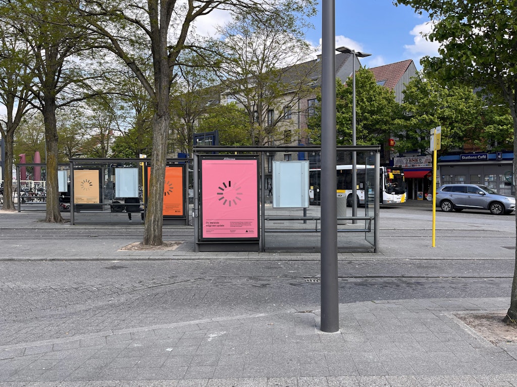
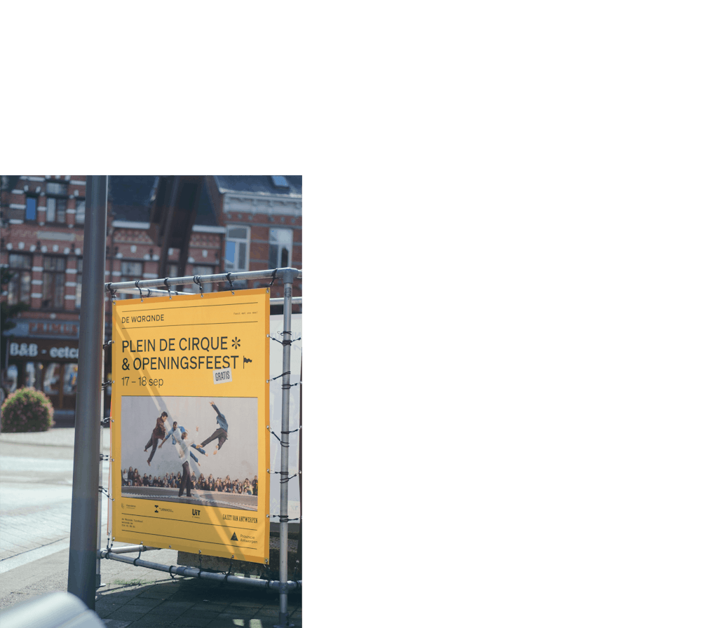
The renewed branding resonates with the Brutalistic aspects of the building. In particular, the renewed colour palette is tuned in to the building’s modernistic architecture and the geometry and horizontality of the building layers are reflected in the dynamic grid, enhancing the layered character of the program, audience and functionalities.
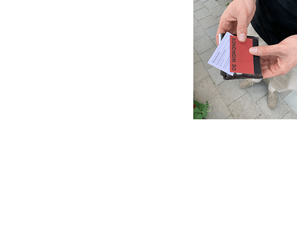
The logo itself originates from the intrinsic centre of de Warande; the main theatre stage and the large welcoming entrance hall, reflected by two overlapping geometric zones. Every aspect of this branding is supported by a story. The sum of all these elements resulted in a branding that feels welcoming, accessible and unpretentious, ready for the next half-century.


By giving de Warande the tools to create content within a structured frame, they can communicate about all aspects of their operation, not only the daily events, a systematic issue we solved for them. It’s a minuscule nuance on paper, but it has a major impact in terms of the general communication approach.